I saw this in an online mag recently. What a cool idea and looks very expensive for something that might be made for reasonably cheap too...wire and ferry lights? Hmmm...
Thursday, 20 December 2012
Thursday, 13 December 2012
White tiles
My husband and I are FINALLY going to do the kitchen and bathroom, and I am SO excited. I have a really clear idea of what I want, so I do feel a little sorry for the trades people who will have to put up with me. One thing for sure, I will be using white rectangular tiles (subway tiles) with grey grout in both the kitchen and bathroom to marry the two rooms. Here are some images I'm using for inspiration:
Tuesday, 4 December 2012
Guest Bedroom
Me and my design assistant (my husband) have been very busy the last few days decorating the guest bedroom. My little sister is coming to stay with us for a couple of months and so we wanted to get it finished in time for her arrival today. There are still a few finishing touches, but all in all I am happy with how it is coming together.
This was the room before:
This is the room after:
What we did: We measured stripes on the feature wall and used masking tape to line up the spaces. We painted the old dresser red which used to be a glossy brown and replaced the handles with little knobs we bought in the South of France earlier this year. I painted the old mirror to match the colour of the stripes on the wall. The clip boards and little clock are from Typo and the prints were bought a few months ago on sale on Onceit. The Keep Britain Tiday poster was bought at the Tate Modern earlier this year. The GB flag cushions are from Redcurrent. We also replaced the old glass wall light with a more contemporary red fabric shade.
Monday, 26 November 2012
Summer Home
I have started watching the new series on The Living Channel called Summer Home by HGTV (same network brought us Sarah's House/Sarah 101 etc). Season 1 is great, but I have been looking at the stills for season 2 and it looks even better! Look at these amazing transformations:
Before:
Before:
Before:
After:
Before:
After:
Wednesday, 14 November 2012
Cockatoos Wallpaper
Friday, 2 November 2012
Bright spaces
I am so inspired by bright and colourful spaces at the moment. The last room pictured is from Sarah 101 and is called vibrant living room. It is possibly my favourite of her design scheme's to date. I am so in love with the pink sofa with decorative piping.
Tuesday, 30 October 2012
Sofitel Queenstown
Not quite as glamorous as Eichardt's, but charming in its own right (and substantially cheaper) the Sofitel is where I resided over the long weekend. The room was very spacious but didn't have the wow factor of the lobby – with its sweeping staircase and scheme of gold, black and yellow. I can't fault the bath tub though.
Monday, 29 October 2012
Eichardt's in Queenstown
Thursday, 18 October 2012
Shed 5
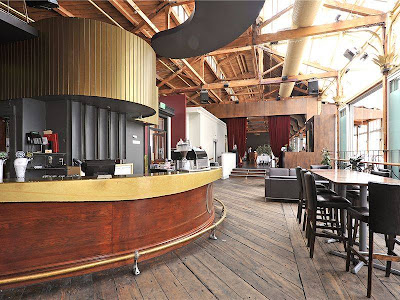
I am a big fan of anything industrial which has been converted for use as a restaurant/home/shop - basically anything other than its original purpose. An iconic example of this is Shed 5 on the Wellington waterfront. I went there for dinner recently and the although the decor could do with updating, being at a world-class restaurant housed inside an old shed creates a unique atmosphere. I love the colour chosen for the exterior weatherboard.
Subscribe to:
Comments (Atom)


Follow me on: Facebook Pinterest Instagram