Tuesday, 30 October 2012
Sofitel Queenstown
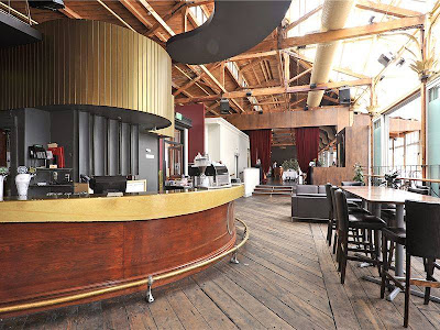
Not quite as glamorous as Eichardt's, but charming in its own right (and substantially cheaper) the Sofitel is where I resided over the long weekend. The room was very spacious but didn't have the wow factor of the lobby – with its sweeping staircase and scheme of gold, black and yellow. I can't fault the bath tub though.
Monday, 29 October 2012
Eichardt's in Queenstown
Thursday, 18 October 2012
Shed 5
I am a big fan of anything industrial which has been converted for use as a restaurant/home/shop - basically anything other than its original purpose. An iconic example of this is Shed 5 on the Wellington waterfront. I went there for dinner recently and the although the decor could do with updating, being at a world-class restaurant housed inside an old shed creates a unique atmosphere. I love the colour chosen for the exterior weatherboard.
Monday, 8 October 2012
Est magazine
This house was featured in Est magazine (a free Australian design magazine which can be found at: estmag.com) I absolutely love it and keep looking at it all the time. The colours are so light and airy and the furniture is contemporary, yet soft. I'm going to use this house as inspiration for my own house.
Wednesday, 3 October 2012
Earthy sunroom
My aunty has just finished decorating her sunroom and I think it is looking great. In fact, when I stayed recently I spent at least four hours in there with lots of reading material. I love her use of earthy colours mixed with accents of cream and the wicker furniture ties in nicely. All the greenery outside the windows makes you feel like you're in your own little sanctuary.
Monday, 1 October 2012
Karen Walker vs Kate Sylvester
Karen Walker for Myer vs Kate Sylvester for Douglas & Bec = NO COMPETITION!
When I heard Karen Walker was doing home wares for Myer, I thought: this will be good. I love Karen Walker clothes and I imagined a collection consisting of old-school charm with rich modern colours.
I was wrong.
The collection advertised is pretty uninspiring. I don't know if there is more to come, but at the moment all I see is iconic Karen Walker prints transferred to duvets and mugs. Hmmm…
Kate Sylvester has now collaborated with Douglas & Bec and the result is fabulousness.
If Karen Walker home wares had a flight against Kate Sylvester furniture, Kate Sylvester would win. The collection is designed by Rebecca Snelling and inspired by the Kate Syvester aesthetic. It is contemporary with a twist and uses pale pastel colours (purposely in keeping with what is in the clothing shops for spring?) There are a few pieces I wouldn't mind owning.
Oh and as a side note: don't get me started on how unfair it is that clothing designers easily get their foot in the interiors door. Maybe in order to be noticed, I have to first make a name for myself in fashion?? Something to think about…
Karen Walker collection
Kate Sylvester collection
F. G. Smith Eatery and Aroha & Friends
A cool new cafe has opened up in Ahuriri, Napier called F.G. Smith Eatery. Design shop Aroha & Friends has moved from town into the warehouse space next door. Together they made a very chic place to visit. Start off by having a coffee and passion fruit lamington and then peruse the shop afterwards. I especially love the outdoor area which is a bit of a sun trap. Officially my new favourite place to visit while in HB.
Subscribe to:
Comments (Atom)


Follow me on: Facebook Pinterest Instagram